
Summarizing the history of a 175-year-old magazine—that’s 5,107 editions with 199,694 pages containing 110,292,327 words!—into a series of graphics was a daunting assignment. When the hard drive with 64 gigabytes of .pdf files arrived at my home in Germany, I was curious to dig in but also a bit scared: as a data-visualization consultant with a background in cognitive science, I am well aware that the nuance of language and its semantic contents can only be approximated with computational methods.
I like to start by brainstorming concept ideas and data-discovery questions and immersing myself in the available materials. To get inspired, I read samples of the magazine across the decades, marveling at the old illustrations and typefaces. I set up a data-preprocessing pipeline early on to extract the text from the .pdf files and run the first analyses. I used Jupyter Notebooks (a flexible programming environment for data exploration) with the spaCy Python library (which uses computational linguistics to turn mere character sequences into a structured representation of language) as well as the pandas package (a tool kit for processing large amounts of numeric data easily and quickly).
A central question in any data-science project is how wide a net one casts on the data set. If the net is too coarse, all the interesting little fish might escape. Yet if it is too fine, one can end up with a lot of debris, and too much detail can obscure the big picture. Can we find a simple but interesting and truthful way to distill a wealth of data into a digestible form? The editors and I explored many concept ideas: looking at sentence lengths, the first occurrences of specific words, changes in interpunctuation styles (would there be a rise of question marks?), and mentions of persons and places. Would any of these approaches be supported by the available data?
It soon became apparent that any texts from the predigital era of Scientific American (before 1993) are to some degree affected by optical character-recognition (OCR) errors. Reconstructing the original text from images is an inherently noisy process where letters can be mixed up (for instance, “substantially” was often parsed as “snbstantlally”), words might be combined or split at the wrong places, or multicolumn layouts might be read in the wrong order. Accordingly, zooming out on the data-analysis lens to a yearly perspective (rather than working on the level of individual editions) and analyzing the count of single words (rather than looking for compound terms or doing sentence-level analyses) became our sweet spot in the trade-off space between accuracy and robustness against noise.
My first intuition was to focus on “what” has been written about, but working with the data, I became especially intrigued by looking at the “how”: the evolution of verbs, adjectives and adverbs. These word types can tell so much about how the tone and attitude of the original magazine have changed from the engineering-driven, mechanistic language to the multifaceted science magazine we know today.
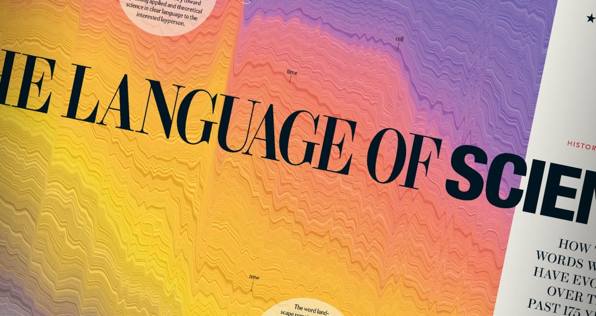
Another key insight was learning that there is actually very little variety in the vocabulary used in the English language. Given that the frequency of words in a language (and in the corpus of Scientific American‘s text archives) is so skewed, rather than comparing raw numbers of how often words occur, it became far more compelling to look at how the proportion of text a word occupies each year (its relative frequency) evolves over time.
Based on this central idea, we explored many different visual forms—word clouds, stack area graphs, line charts, animations, spatial maps of semantic spaces—before settling on the layered stacked area chart for the opening spread as the overview visualization. This high-level view of the major shifts in vocabulary, shown as “sediment layers,” is complemented by the individual miniature line charts showing the evolution of each top peaking word per year.
Making dense chart arrangements effortlessly scannable requires conscious visual design choices. Reinforcing the shape of the line chart with a continuous color scale may seem like a redundant decoration, but it is perceptually quite effective because it allows us to quickly see if a word is “old” or “new” without studying the line shape in detail. In addition, the color associations (gray/brown representing the mechanistic, vintage past, compared to a fresh, modern purple for the present) help to tie data semantics and visual form together.
Doing data science means having to live with imperfections. No model can be a 1:1 reproduction of reality, and some of the data still remains mysterious to me. For instance: Why does the use of “substantially” drop so substantially after 1868? (I suspect some OCR errors in connection with new typefaces.) Others are launching points for investigation: Why did “tomato” peak so heavily in 1978? Each new discovery instigates curiosity, and I encourage others to view this data set not as an objective and final measurement but as inspiration for new questions.
Explore the data yourself at www.scientificamerican.com/interactive/science-words