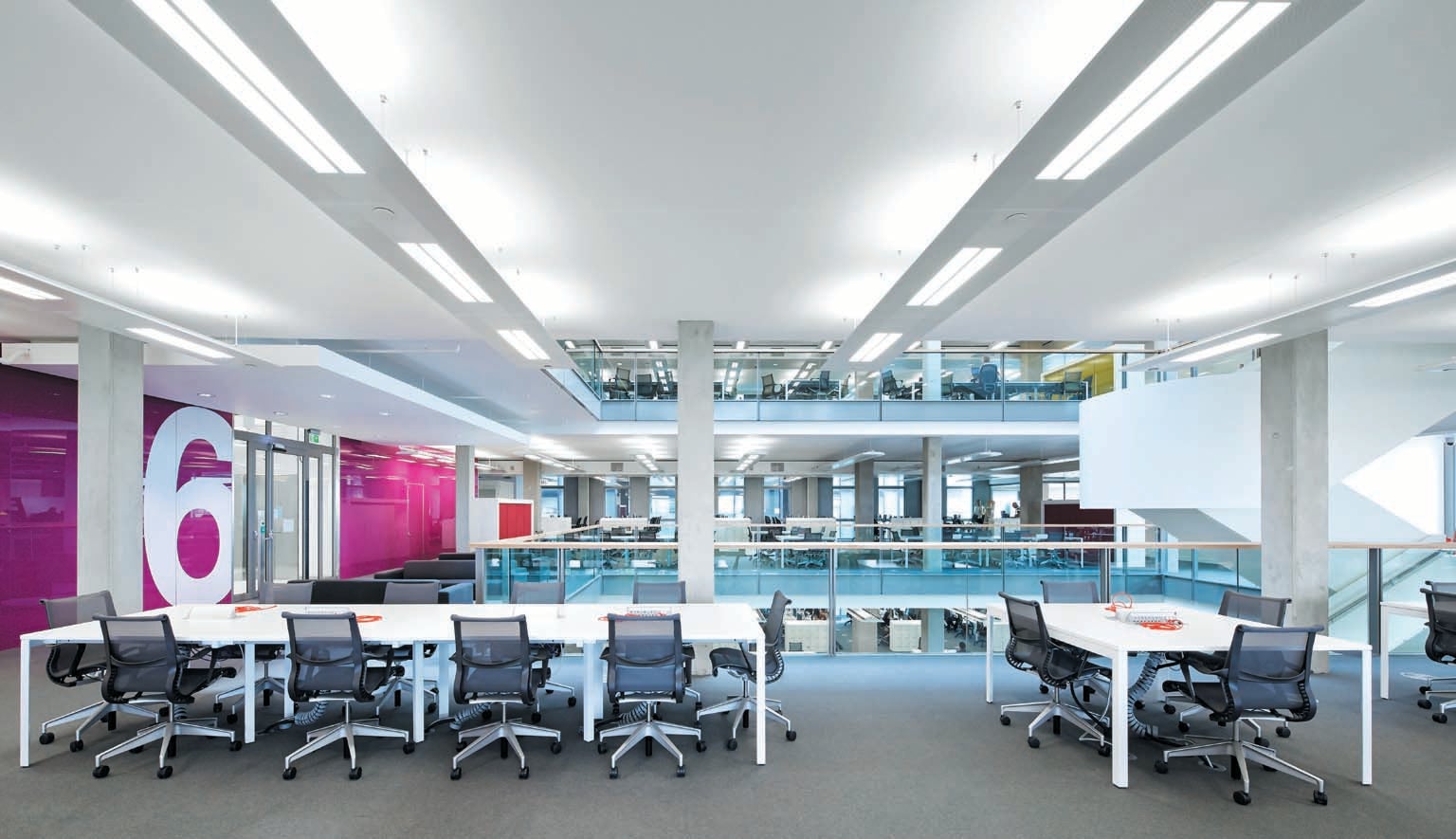
In 1967 chemical company DuPont gutted a floor of an office building in Delaware and rebuilt it. The firm put almost everyone into one big room with low partitions. In one corner, they provided a lounge with armchairs and Eero Saarinen end tables. This was the first major corporate adaptation of an “open-plan” office in the U.S., following the latest thinking by German architectural designers. Those designers held that companies increasingly relied on professionals—or knowledge workers, a term coined in 1959—who bristled at corporate hierarchies and needed more opportunities to collaborate. At DuPont, the new arrangement housed the company’s Freon refrigerant division. Freon began to be phased out in 1987 because it was destroying Earth’s ozone layer. The open-plan office, in contrast, has spread far and wide. By 2020 two thirds of knowledge workers in the U.S. worked in one, according to a survey by global architecture and design firm Gensler.
Most people wish they didn’t. The writing has been on the cubicle partition since the very first survey comparing this to other office designs was published in 1970. “Few … like a completely open plan with little privacy,” the author wrote. The respondents—358 employees at 18 companies—complained about noise, distraction and soullessness. Apart from some references to ashtrays, the survey might as well have been written in 2020. In a sense it has been: dozens of recent surveys have recapitulated these findings. It’s now well established that open-plan offices fail to accomplish one of their major stated goals—increasing collaboration. Instead, researchers have found, they drive workers into more isolation. The design may also heighten office sexism and health troubles.
For convincing corporate real estate managers that open plans are bad ideas, no survey has had as much impact as an impromptu worldwide experiment, conducted during the past three years, called the COVID pandemic. It proved that most people who used to work in an office can work equally well from home. They’re Slacking, not slacking off. The pandemic also reminded everyone that open offices are germ-filled petri dishes. (This was known before: in 1995 a Finnish study found that sharing an office increased the chance of catching multiple colds a year by a third, nearly the same level of elevated risk as being a parent of young children, who repeatedly bring colds home from schools and day care.)
Gensler, in another survey in 2021, found that nearly a third of the people they asked said they wanted to work from home indefinitely. Half preferred a hybrid arrangement—ideally two office days a week. These new working habits have upended corporate office strategy. Companies that kept shaving inches off workstations to cram in more people now have half-empty facilities. “The office thing is all buggered up,” says Alison Hirst, a business professor at Anglia Ruskin University in England, who has done case studies of the social dynamics in open offices.
Now designers are rethinking not so much the idea of an open office as its execution. In particular, they are doing more to accommodate a diversity of working styles. This trend overlaps with a movement toward inclusive design, which seeks to support people who are hard of hearing or autistic, as well as others who have trouble with conventional offices. Some of the architectural changes that reduce discomfort and productivity issues for these people work for open-plan offices in general. Companies, still looking at their real estate bills, don’t seem inclined to give employees back their private spaces, but they may change how work spaces function.
For example, Gavin Bollard, an information technology manager in Australia, who blogs about his experiences with autism, is deaf and uses hearing aids. “I’ve always struggled with the sound design of the open-plan office structure because it’s hard to know how loud I am talking, and it’s hard to hear effectively when others are trying to be quiet,” he says. Both autistic and deaf people also object to visual clutter, harsh lighting and a feeling of personal vulnerability in an open plan.
These are universal complaints. “Autistic people are canaries in the coal mine: our needs aren’t actually different from typical people’s, just more intense and specific,” says Kirsten Lindsmith, another blogger on autism. By speaking up when neurotypical people might just grin and bear it, she and others can improve the office environment for all. “You design better for the center when you learn from the margins,” says Magda Mostafa of the American University in Cairo, an architect who focuses on design for autism.

A Hard Place to Work
Among all the findings of office psychology studies over the decades, two stand out. The first is that the open office actually makes it much harder for people to collaborate. In 1984 the Buffalo Organization for Social and Technological Innovation (BOSTI) reported on its survey of some 6,000 workers at about 70 sites. Respondents in open-plan offices said they held back on talking to one another so as not to disturb the neighbors or broach confidential subjects in public. Although the BOSTI survey relied on people’s self-reported interactions, Ethan S. Bernstein and Stephen Turban of Harvard Business School corroborated it in 2018 with more objective measures. They had 152 workers at two companies wear sensors to track their movements. After moving from individual offices to an open plan, the workers spent only a third as much time interacting face-to-face as they had before, a striking downturn.
The second finding is that factors such as job function and gender influence how happy or unhappy people are with an open office. In early surveys, for instance, clerical workers said they were happier with an open office—it gave them someone to talk to while filing papers or transcribing memos. Women, however, have more recently reported a distressing fishbowl effect. In an intensive case study of a new open office in 2018, Hirst and Christina Schwabenland of the University of Bedfordshire in England found that women felt the new design put them on display and responded by dressing up. Some found the expectations oppressive and told the researchers that they were being stared at and judged. Several in senior management, though, said they welcomed the opportunity to signal their status through fashion, so in this sense the open office actually reinforced the corporate hierarchy.
Men did not express comparable concerns. “It’s a reflection of a wider societal norm about who looks at whom,” Hirst says. The management team that decided on the design of the office were all men, and when Hirst and Schwabenland interviewed them, they mentioned gender only twice—and even those occasions were cringe-worthy, such as remarks that an open office would make it harder to have an affair.
A spectrum of opinion also shows up when it comes to a design trend that became hot in the early 1990s: the nonterritorial office, in which workers have no assigned space at all. Some companies instituted a “hoteling” system, in which workers could reserve an office or desk for a set period. Others began “hot desking,” in which workers had to scramble for spots like kids in a school cafeteria. By 2020 Gensler found that one in 10 knowledge workers in the U.S. had such an arrangement.
The nonterritorial office is simultaneously the most reviled and the best liked of arrangements. Gensler respondents without assigned desks were split down the middle. In 2008 Christina Bodin Danielsson of the Royal Institute of Technology and statistician Lennart Bodin (her father-in-law) of the Karolinska Institute, both in Stockholm, surveyed 469 employees at 26 local offices. Those in assigned-seat open offices reported the worst health and job satisfaction, whereas those in private offices and nonterritorial or “flex” offices reported the highest. “The flex office appears to be preferred over traditional open offices, and in some cases, it seems to even be better than the [private] office,” Bodin Danielsson says. What workers in nonterritorial offices give up in personalization, they gain in control; they can join a communal table when they need to share ideas and retreat to a nook when they have to concentrate.
But there is an important proviso: offices need plenty of nooks. In 2019 Bodin Danielsson and Töres Theorell of Stockholm University studied hot-desking offices that skimped on breakout rooms or otherwise didn’t have enough space for everyone to find a work space to their liking, and employees were unhappier with this office type. When the goal is to pack in as many employees as possible, the nonterritorial office loses whatever advantages it had.
Unfortunately, that is all too often the case. For a 2021 paper, Ingrid Nappi and Hajar Eddial of the ESSEC Business School in the suburbs of Paris interviewed 16 managers and consultants who make corporate real estate decisions. These people cited expenses such as rent and utilities as their primary reason for instituting hot desking or other nonterritorial features. They acknowledged that the savings could be offset by hidden costs such as lower productivity and more sick days, but these did not appear to factor into their decision.

Different People, Different Spaces
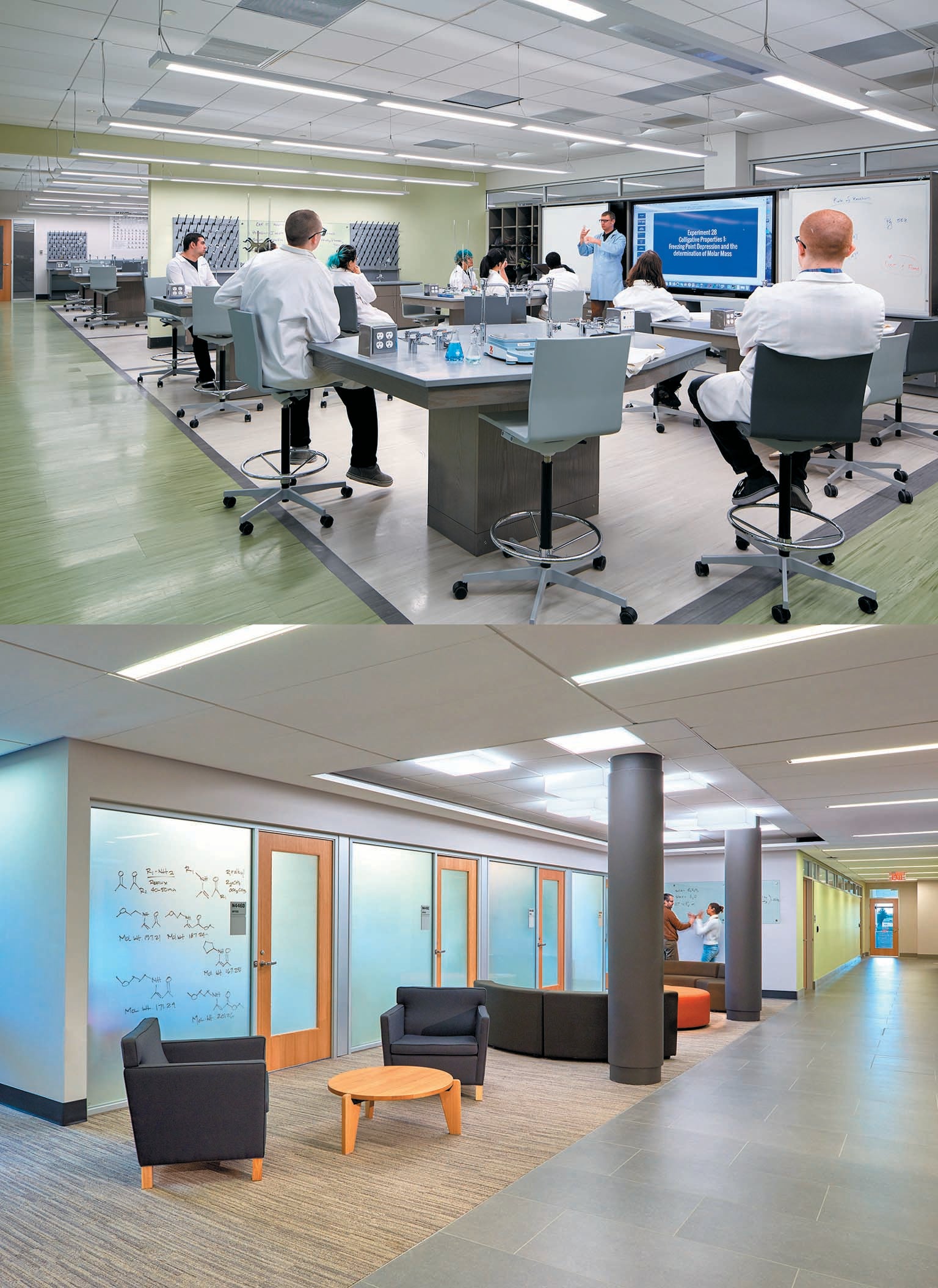
Architects and designers are coming around to the idea that one office size does not fit all. Since the 1990s they have been structuring offices as a quilt work of “neighborhoods,” customizing work spaces by company department. Accountants might get a conventional mix of workstations and conference rooms, whereas marketing people are all about the sofas and whiteboards. “That’s a much more tailor-made solution,” says Alonso Toledo, a strategy director at Gensler in San Francisco. He says his team designs the neighborhoods based on employee surveys and day-in-the-life narratives.
Paying attention to natural human variation is a core principle for designers working with Deaf, neurodiversity and disabilities advocates. Mostafa and others who plan spaces for these groups argue that their work can inform office design more broadly. The failings of the open office are typically sensory, such as noise, headache-inducing lights and visual cacophony—the very things that deaf and autistic people are sensitive to. Neurotypical people may find it expedient to make do rather than make a fuss, but deaf and autistic people are closer to their edge of tolerance.
Deaf people have a lot of experience with getting open floor plans just right. They often prefer an open plan because it gives them clear views of other people for signing. But they don’t always want too much openness, either, because movement in the background can keep drawing their attention and lead to eye fatigue. When the balance of sight lines is right, “there’s an emphasis placed on always seeing one another and knowing where others are in space and being able to have connection to the other,” says Hansel Bauman, a designer in Washington, D.C., whose team at Gallaudet University developed architecture called DeafSpace. “I think there’s a similarity there between what is a desire within the Deaf community and, historically, where people have been with the creative office.”
Robert T. Sirvage is a design researcher who worked with Bauman to develop DeafSpace and identifies as DeafBlind. (He is deaf and visually impaired.) Sirvage contrasts two architecture firms where he has worked. The first had a large, hangarlike space fitted out with rows of workstations. “In general, I don’t love rows, I will say that,” he says. “But in that setup, it was great.” Each team occupied a row. People could go home and leave papers and blueprints scattered around in collaborative work spaces; there was no leave-it-so-someone-else-can-use-it policy. The coherent spatial organization made it easier for Sirvage to work with hearing colleagues who didn’t sign. “If I can just point over in that direction, and we know what that direction is, and what’s there, and what that means, then we have a common schema,” he says. The second office lacked this clarity. It was stylish but labyrinthine and didn’t provide each team a dedicated meeting space. “It was hard to know what the focus of different spaces was,” he says.
Yushi Zhang, a master’s student in public health at Yale University who is neurodivergent, has her own tale of two offices. She worked at a newspaper in Chengdu, China, that had a huge, wide-open bullpen office, which people on the autism spectrum often describe as their nightmare. Yet she felt comfortable because the background noise was low and large windows provided natural lighting. Later, she moved to the U.S. and worked for an insurance company in a cubicle farm without much natural light. She had more privacy than before, but that also meant her interchanges with co-workers never got past small talk, which she and many other autistic people loathe. “Ask me ‘How are you?’—when I first came here, I really didn’t know how to answer that question,” she says. “I would be standing there, wondering, ‘Are you really wanting to know how I’m doing?’” She missed having natural lighting, too. “I feel like the bright light is too loud,” she recalls. “It’s screaming to me. It’s like my ear hurts.” She quit after three months.
Bauman and Mostafa both consult for the New York–based studio MIXdesign, where they merge the principles of designing for neurodiversity and for deafness. Reducing visual distractions and acoustic noise helps both autistic people and those who use hearing aids or cochlear implants. Adding breakout spaces along hallways and sidewalks lets autistic people take a breather and deaf people step out of the flow of traffic for a signed conversation.
Not every feature is a win-win, though. Making a room hypertransparent for people who are deaf may overstimulate people who are autistic. Widening a hallway to give people who are deaf more room to sign may make it harder for people who are blind to find their way. “Part of our philosophy in MIX is to ensure that that intersectional approach doesn’t, by creating access to one cohort, create a barrier for another,” Mostafa says. Often they best they can do is to create variety, so that everyone can find what they need—a spectrum of space.
Listening to Workers
Perhaps the most important innovation of inclusive design is not the design itself but the process. Most people who have been through an office redesign get the feeling that companies solicit workers’ views less to inform the design than to get them to acquiesce in whatever top management has already decided. Executives often “say, ‘Low-level workers and ordinary workers really don’t need to be included. We only need to give them the illusion of inclusion,’” notes Jennifer Kaufmann-Buhler, a design historian at Purdue University who has written a book on the adoption and spread of open offices.
Inclusive designers, on the other hand, adopt the disabilities-rights principle of “nothing about us without us.” The Deaf community, especially, has a strong ethos of inclusivity. Bauman describes what often happens when hard-of-hearing people go out for drinks after work. “First thing that happens is all the furniture gets moved. You’ve got to get so you can see each other; everyone’s concerned about the lighting conditions and what the background is,” he says. “Always the manager of the bar comes over and gets upset because you’re moving the chairs.” Bauman describes DeafSpace as this sense of agency, writ large.
So far, though, he and his colleagues at MIXdesign have yet to demonstrate these principles in an actual office; their practice focuses on schools and museums. Even these institutions, which give a high priority to accessibility, have to justify the extra expense. So designers must make the case for a net benefit over the long term. “It’s probably the single most challenging element of the work that we do,” Mostafa says.
Toledo says he is encouraging companies to use the pandemic as an opportunity to evolve. “It seems to me a bit forced that we’re assuming that there needs to be an office,” he says. Some companies are going entirely virtual and building their human connections in other ways, such as regular staff retreats. A shared office can provide everyone with equal work resources, but there are other ways to perform that democratizing function, Toledo says. Many companies are now paying at-home employees for their Internet service and ergonomic chairs; some U.S. states even require it.
Putting these ideas together, Bauman sees a huge opportunity. With so many people working from home, companies need less office space, and building owners are considering converting offices to apartments. These spaces—both work and home—could easily be built to inclusive-design standards: plentiful natural lighting, quieter air-handling systems and, above all, variety.
There may be “places where you might limit visual exposure and visual access, and there’s other places you might open up visual access,” Bauman says. A single building might have a mix of apartments and co-working spaces, not only supporting diverse work patterns but also creating enclaves for people from the Deaf and neurodiverse communities, as well as others with particular needs. “It inherently has the ability to create communities for people of difference,” he says.
Toledo emphasizes that no one is sure what the next stage in the evolution of the office will be. Businesses and workers will need to live with this uncertainty and embrace an experimental, trial-and-error spirit. “The planning that we do is always like the light from the stars,” he says. “We are seeing the past.” And hoping that we can avoid repeating its mistakes.


